
What is Atlis?
Backstory
Atlis Design is the company I created to represent my design work. I have always worked under an alias. I had the “azod.nem” alias for my social medias and online presence; which eventually just led to Azod being a nickname. I came up with that name when I was like 13, it is literally just my last name in reverse, and with a dot in the middle. I had a larger plan for it where I could change the “nem” into a variety of things such as “azod.radio“ or “azod.com”. With this concept I had planned “azod.nem” to be my original alias, and then everything else would have its own focus, a different outlet for me to branch out in. I have always been a creative individual that liked having the option to express myself in many different forms. I did not like the idea of boxing myself into any one field.
Eventually I realized that it would be a better idea to have a separate name and identity for my design work. This was when I came up with the Atlis name. This name came from my love of Greek mythology and specifically the myth of the titan Atlas. I identified a lot with the story and saw a bit of myself in it.
-An entity with a huge responsibility that he did not necessarily ask for, but was still taking head-on. All this because he was defending and trying to fight for his family’s honor. -
This story definitely struck a chord with me being an immigrant and a first-gen college student for my family; now the first college graduate. I felt this immense pressure all through my academic career, not only to succeed in school but also to be a good role model for my younger brothers.
The Design
Once I landed on the name Atlas, I decided to swap the “a” for an “i” so that it would sound the same when pronounce phonetically, as Spanish is my native language I wanted it to sound the same when pronounced by both English and Spanish speakers. I also changed it to differentiate it from the many other companies with the same name.
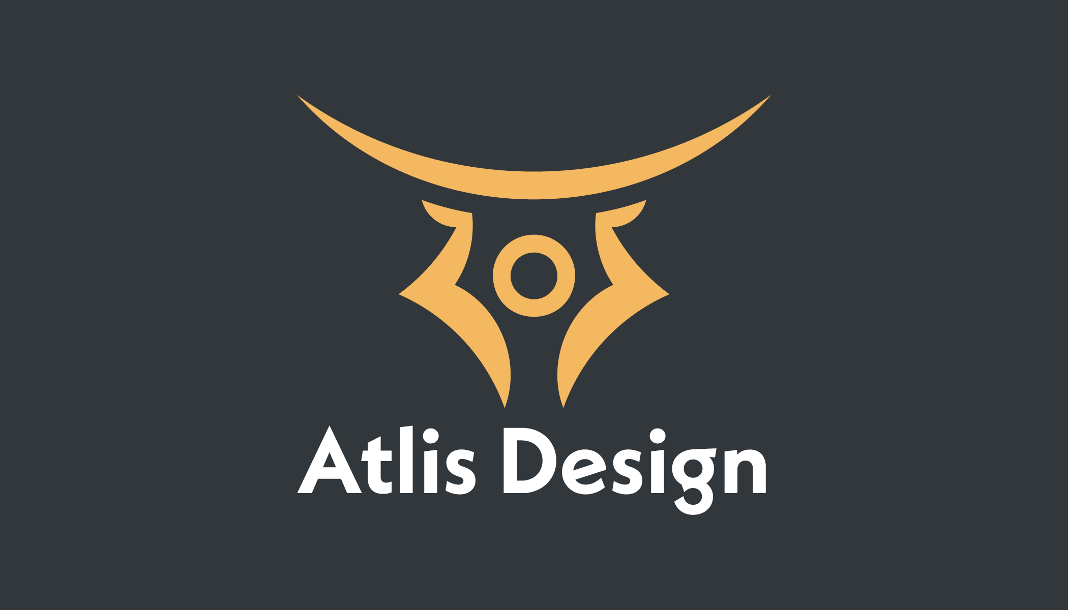
It was a long process of designing the final logo, I wanted to convey not only the tale of Atlas but also I wanted to convey the message that It had to do with art and design. Eventually I landed on the final logo which you can see on the website. The Icon is not only a drawing of Atlas holding up the sky over his head, but it also makes the shape of the pen tool in Adobe Illustrator which is the design program I use the most and that is the tool I use the most within the program. To me it is THE most useful tool seconded only by the pathfinder tool.